
01 / Archive review
Read the long canvas
The red-and-green forms repeat along the board. Their rhythm is affected by the narrow format and the amount of uninterrupted space between them.
PROMISE TO PREVAIL
Preparing your experience
PROMISE TO PREVAIL / PRODUCT CONCEPT
Taking the brand’s graphic language into action sports.
Explore the process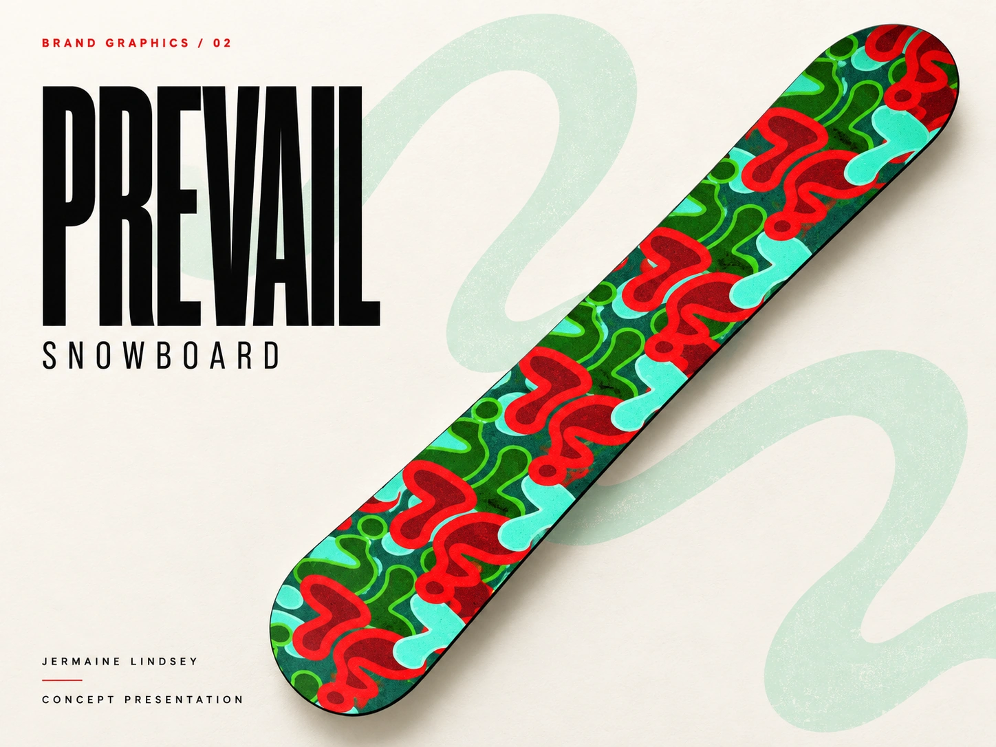
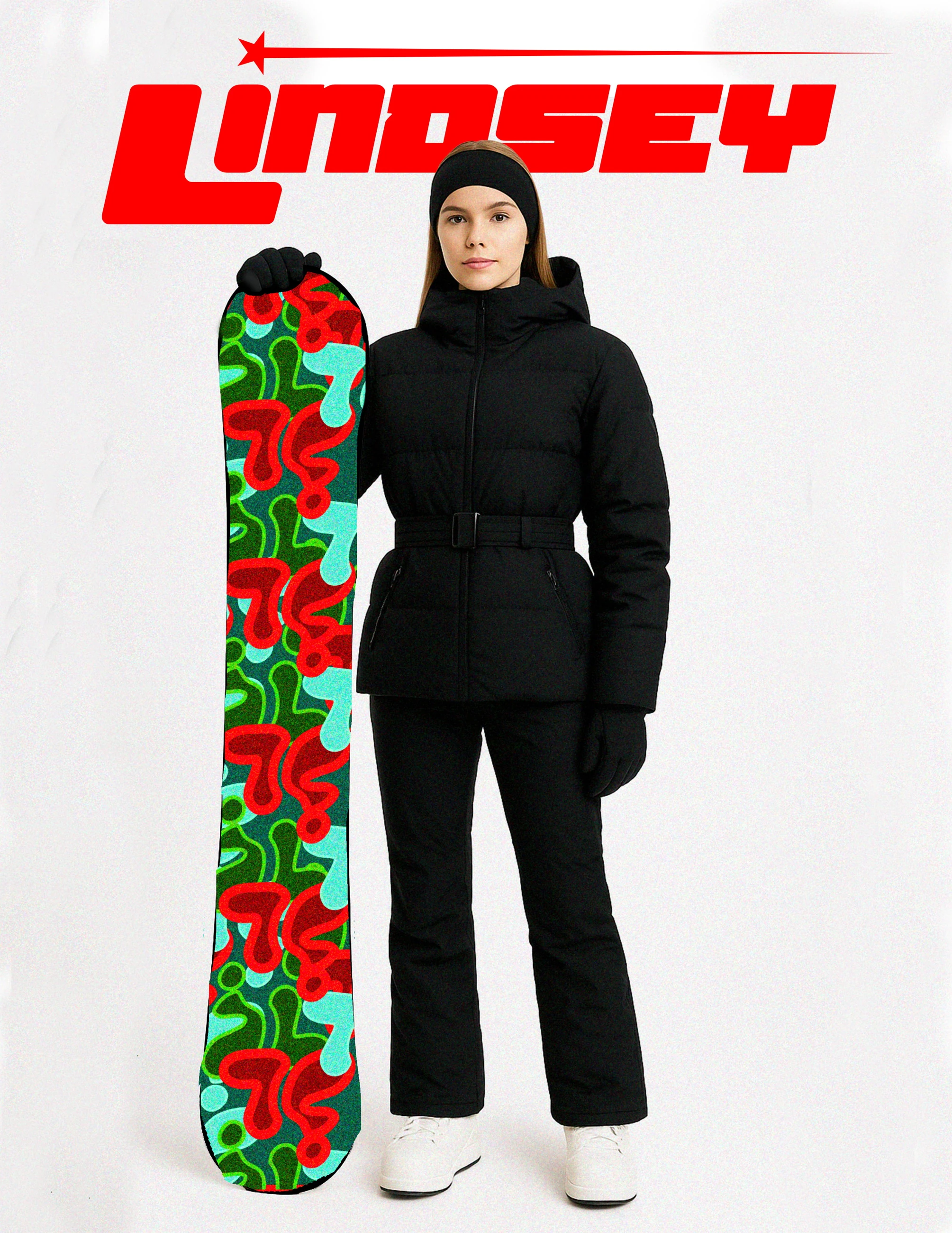
This study brings the expressive graphics of Promise to Prevail onto the long, narrow surface of a snowboard. Repeated red and green forms build a recognizable pattern, with dark outerwear providing a quieter visual counterpoint.
The project explores graphic placement and product presentation. The board is shown as a design concept, with the focus on visual identity and composition.
GRAPHIC SYSTEM
The board’s long, narrow format changes how a graphic is read. Repeating the red and green forms carries the visual rhythm along the surface rather than concentrating all the information in a single placement.
The adjacent dark outerwear creates a calmer field around the graphic. That contrast lets the board act as the expressive element within a broader product and styling presentation.
PROJECT OUTPUT
The concept explores graphic application and the relationship between a product and its surrounding look. It provides a visual direction for extending Promise to Prevail into an action-sports context.
The presented work concerns composition, placement and identity. Board construction and ride performance are outside the documented concept stage.
PROCESS NOTEBOOK
The supplied board image supports a graphic-placement study rather than a construction claim.
Archive review connects the existing work below. Next explorations describe new development ideas.
01 / Archive review
The red-and-green forms repeat along the board. Their rhythm is affected by the narrow format and the amount of uninterrupted space between them.
02 / Next exploration
A new study could contrast the full repeat with a single enlarged motif. The first emphasizes rhythm; the second would concentrate recognition in one area.
03 / Next exploration
A dimensioned top-sheet template would make placement easier to evaluate. Binding positions and edge clearance should be established before treating the image as a production layout.