
A look is the browsing unit.
Each look has an image, name, category and description. Repeating those fields gives the collection a consistent structure across different garments.
PROMISE TO PREVAIL
Preparing your experience
02 / Brand experience · Web interface
Promise to Prevail brings a fashion identity into an interactive storefront—giving the garments room to lead and the visitor a clear way to explore.
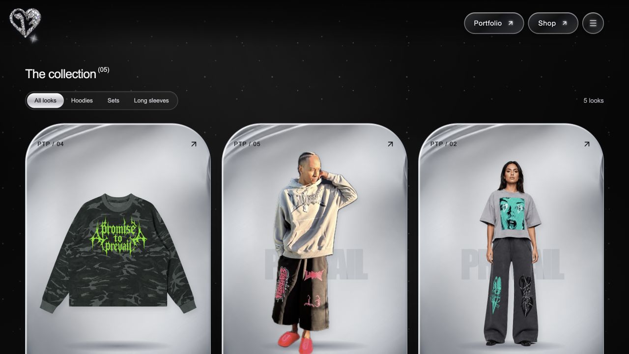
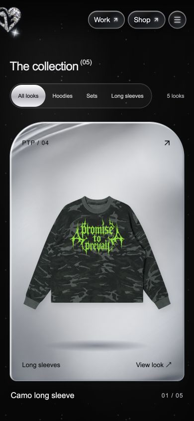
Actual screens captured from the working website source, September 2026. Desktop and mobile present the same collection in different spatial arrangements.
The collection combines graphic apparel, full outfits and a distinctive chrome-and-black visual identity. The interface needs to carry that character while giving visitors clear controls for browsing and inspecting a look.
The current experience offers an expressive runway and a direct collection grid. This case study focuses on the collection: category filters narrow the set, garment cards open a detail view, and visitors can move between looks without returning to the grid.
Enter the runway or go directly to the collection.
Choose All looks, Hoodies, Sets or Long sleeves.
Open a look, read its description and switch to a close-up.
Move to the next look or close the view and resume browsing.
A retrospective wireframe study of the implemented collection and look-detail screens. These diagrams simplify the current interface; they are not presented as original planning artifacts.
Description
Each look has an image, name, category and description. Repeating those fields gives the collection a consistent structure across different garments.
The selected category determines the visible cards and count. Opening a card uses that look’s identity to populate the detail dialog.
Previous and Next move through the full collection. Close-up resets when the look changes. Closing the dialog returns the visitor to browsing.
| Action | Visible response | Detail to evaluate |
|---|---|---|
| Choose a category | Cards and look count update; selected tab changes. | Do visitors understand the category names? |
| Open a look | Full-garment detail opens with its name and description. | Is the next action clear? |
| Use Close-up | The garment image switches scale. | Is the enlarged view useful on a phone? |
| Use Previous or Next | Moves through all looks; close-up resets. End controls disable. | Should this respect the active category instead? |
| Close the dialog | Selection clears and the collection remains available. | Can keyboard users resume browsing comfortably? |
The grid is filtered, but the detail arrows traverse the full collection. That behavior is visible in the current implementation. A next iteration could compare staying within the selected category with continuing through every look; neither option is claimed as tested here.
Silver product stages give the garments a consistent backdrop. A dark surrounding canvas connects the collection to the brand’s runway, while concise names and category labels anchor each card.
The selected category has a bright filled state. The visible look count changes with the filter, providing feedback without moving the visitor to another page.
Each card uses the same relationship between image, category, name and position. Different silhouettes share a recognizable browsing structure.
Category selection changes both the displayed garments and the count. The active filter stays visible above the results.
A detail dialog keeps the visitor in the collection. Previous, next, close-up and close controls support continued exploration.
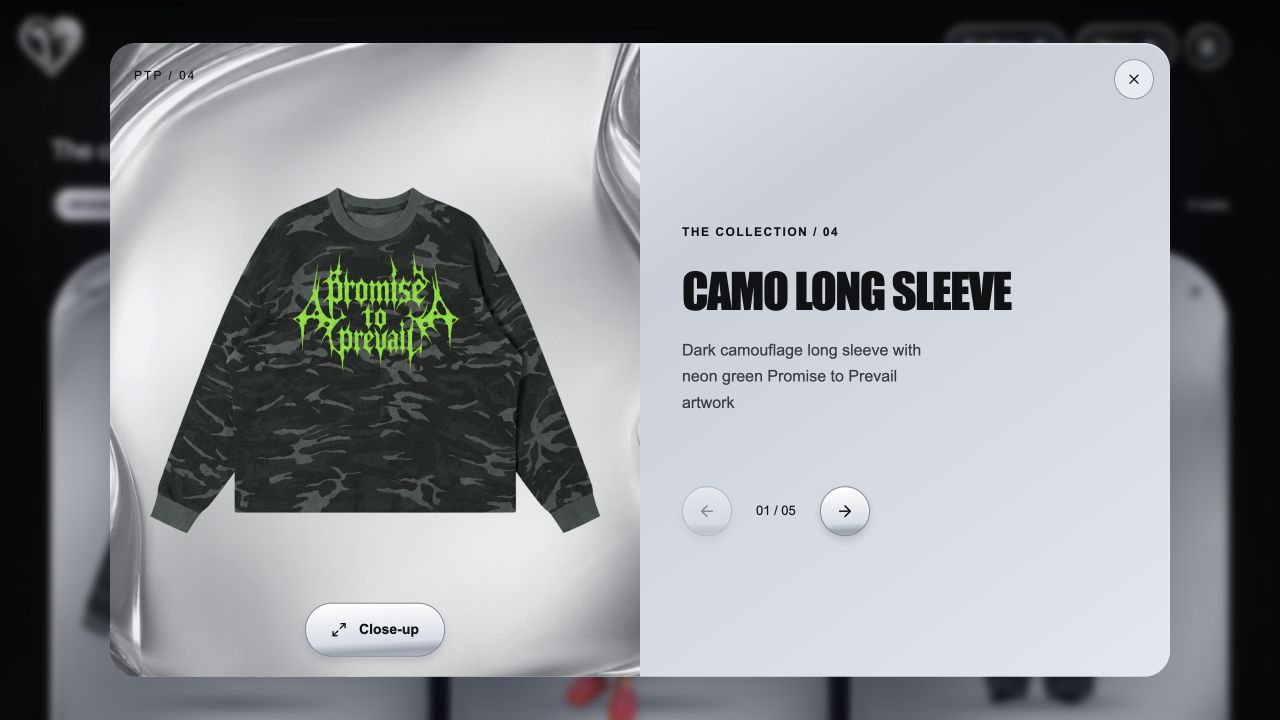
The collection’s look-detail view. This is a browsing surface; purchase options belong to the separate Shop flow.
The first look disables Previous; the last disables Next. Switching looks resets the close-up view, so the next garment opens at its full scale. Closing the dialog clears the selection.
The runway also provides button and keyboard navigation, and parts of its motion respect the visitor’s reduced-motion setting. Those implementation choices support access beyond a scroll-only experience.
A useful next study would ask people to find a specified garment, inspect it and locate the purchasing flow. The main questions are whether the category labels feel natural and whether the distinction between Collection and Shop is clear.
Observe completion, hesitation, keyboard access and mobile readability before changing the flow. These are proposed evaluation steps, not results from completed user testing.