
A link with a clear destination.
The banner is reachable by keyboard and touch, with a visible focus outline. The menu route remains. Its single entrance animation is removed under reduced motion.
PROMISE TO PREVAIL
Preparing your experience
PROMISE TO PREVAIL / OWN-BRAND WEBSITE
A fashion storefront and a multidisciplinary design portfolio share one identity. The interface makes both visible, while keeping browsing, hiring and purchasing legible.
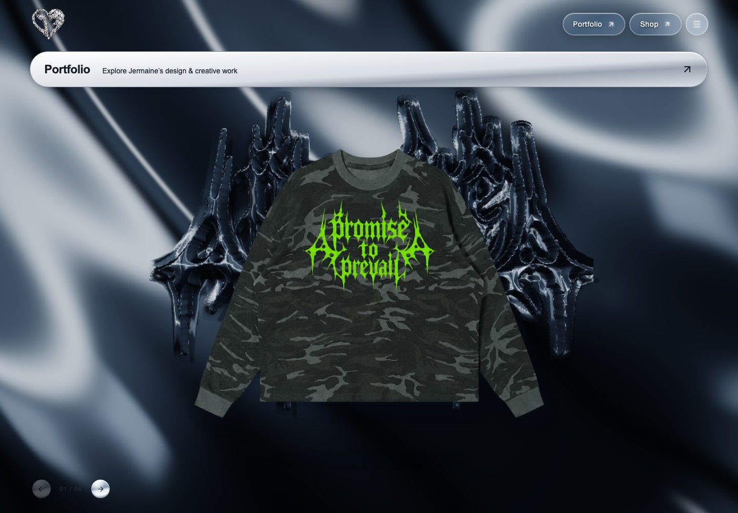
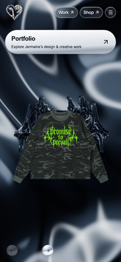
Actual website screens captured 5 October 2026 at desktop and phone widths, with reduced motion enabled. Open any screen to inspect the full-size capture. These images document implemented screens; no measured user outcomes are claimed.
The homepage leads with an expressive horizontal runway. The portfolio already has a header link and an entry in the navigation drawer, but Jermaine asked for a more prominent invitation for store visitors to discover his design work.
A wide Portfolio banner adds that invitation below the header. It uses the existing raised silver button language and a directional arrow, with one short slide entrance. The entire banner is a normal link; there is no hidden gesture or dismissal step. The original menu route remains available.
Runway → Collection → look details.
Portfolio banner or menu → selected studies → project evidence.
Work with me → services and public contact.
Shop → product options and cart → the separate checkout flow.
Runway, Collection and Shop are distinct views. Collection is a visual browsing surface, rather than a purchase button disguised as a look card. Shop remains its own commerce destination. The portfolio returns to the brand homepage and keeps Shop in the shared navigation.
Hiring links lead to the existing services/contact page. This lets the portfolio introduce disciplines without repeating the whole service page. The banner appears on Runway and Collection; it is omitted from Shop and checkout so purchasing controls keep their space.
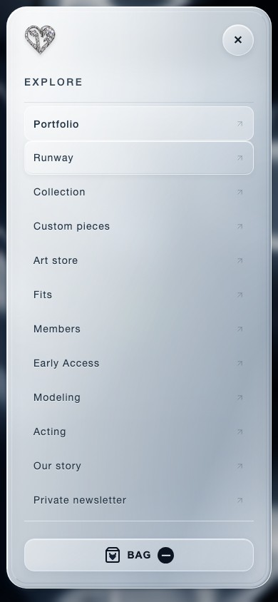
Routes are implemented controls. This map is a retrospective explanation of the current interface, not evidence of a completed information-architecture research study.
The portfolio’s original films occupy one straight full-background frame behind the editorial serif title. Good American and SKIMS independent studies follow immediately, then interface and footwear evidence. The portrait and wider catalog remain part of the page.
Large images carry the comparison on desktop. At phone width, studies stack into a reading sequence; text, captions and links stay next to their evidence. The film defaults to a still on mobile and reduced-motion devices. Mobile playback is an explicit choice, rather than an automatic download.
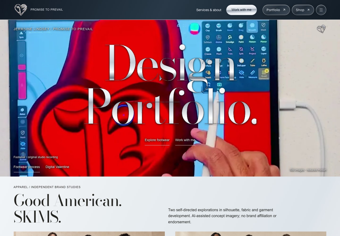
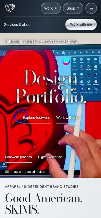
Same identity, different composition. Chrome title treatment applies to type; original artwork and films keep their own color. Independent concept, AI-assisted and collaboration labels remain part of the project evidence.
Category tabs update the visible garment cards and look count. A look opens in a dialog with a close-up option. Previous and Next move through the complete look list; the first and last positions disable the unavailable direction. Selecting another look resets close-up scale.
The active category remains visible when the dialog closes. One unresolved decision is whether Previous and Next should follow only the selected category. The implementation currently uses the full collection; the case study records that behavior instead of implying a validated filter-specific flow.
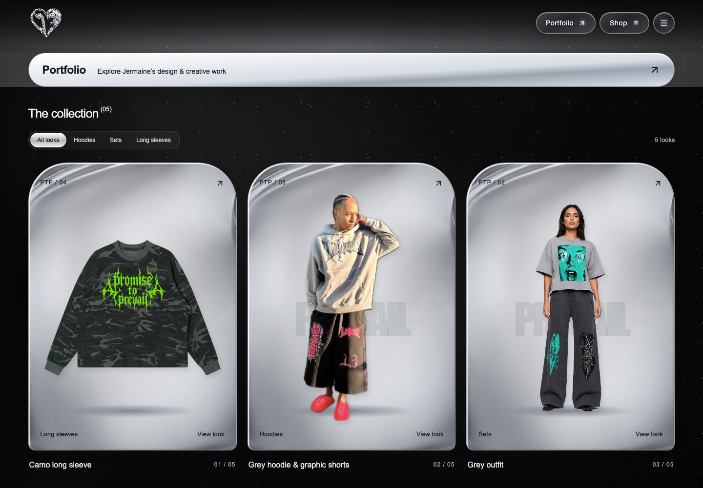
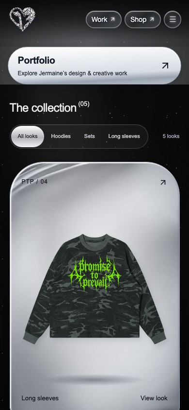
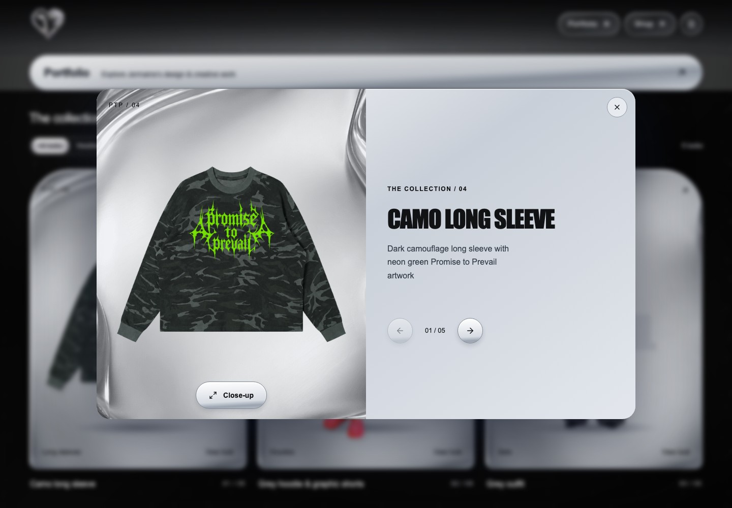
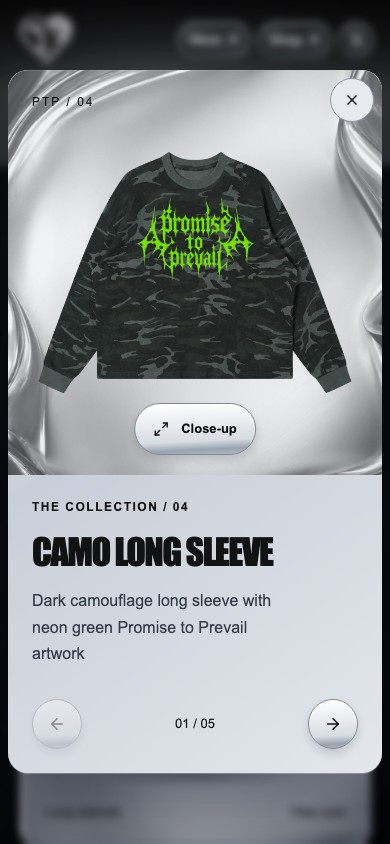
Actual grid and dialog states. The phone composes image and description vertically; desktop places them side by side. These are current viewport captures, not invented client deliverables.
September’s retained collection captures document the earlier implemented browsing interface. The October revision adds a prominent portfolio invitation, brings selected studies forward and gives the website itself a fuller design case study. This comparison is based on archived screens and the current source, not a reconstructed design history.
The goal of this revision is clearer discovery and stronger evidence of the practice. No analytics or completed usability study establishes that the goal has been achieved. The portfolio now shares the store’s diamond-heart mark, rounded glass navigation and silver material palette. The editorial serif hero remains a deliberate title treatment within that shared system; collection mechanics, contact destinations and commerce flow are retained.
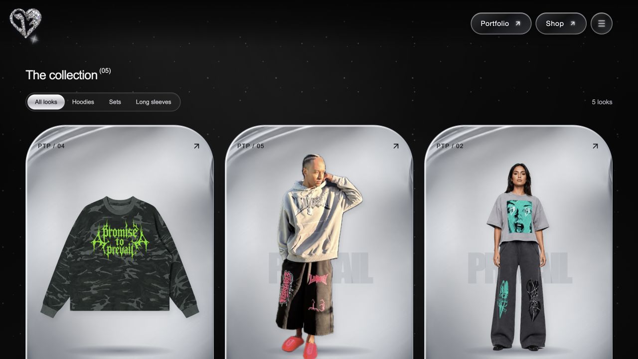
The banner is reachable by keyboard and touch, with a visible focus outline. The menu route remains. Its single entrance animation is removed under reduced motion.
Only the selected hero film plays. Hidden and offscreen playback pauses; failed media falls back to original stills. Those are checked behaviors, not engagement claims.
Original sketches, actual screens and recordings are distinguished from independent concepts, AI-assisted presentation and proposed next development.
A future usability pass should ask people to find a garment, locate Shop, discover a relevant portfolio project and reach public contact. Observe which route they choose, any hesitation and whether the Collection/Shop distinction is clear.
Keyboard navigation, phone readability, media preferences and filtered look navigation deserve explicit tasks. These are proposed evaluation steps. Local browser and build checks verify implementation behavior; they do not establish customer satisfaction, accessibility certification or conversion performance.