
Let the letters set the volume.
The enlarged letterforms define the upper and create the main silhouette. Their scale turns graphic identity into a three-dimensional feature rather than a small applied logo.
PROMISE TO PREVAIL
Preparing your experience
FOOTWEAR / INDEPENDENT BRAND CONCEPT
A SKIMS footwear concept built around a sculptural wordmark and saturated red.
Independent concept by Jermaine Lindsey. Not an official SKIMS product or commission.
Explore the process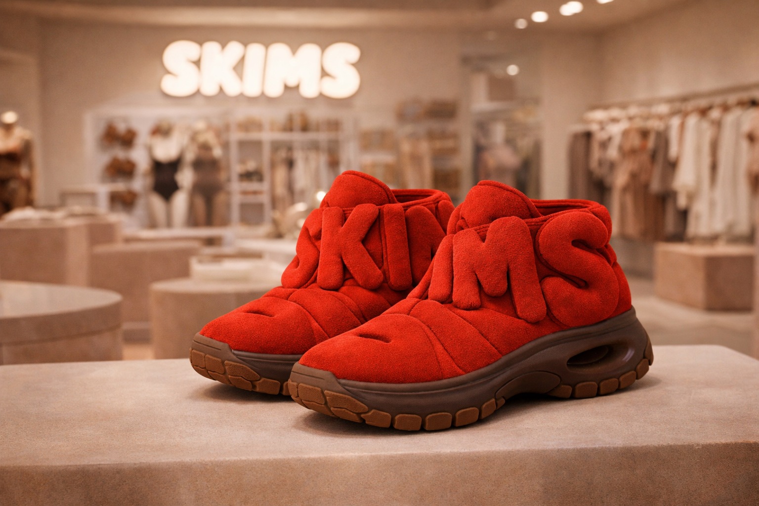
Oversized letterforms become the defining volume of the upper. A deep red surface gives the silhouette a single, concentrated identity, while the darker sole anchors the form.
The study explores the relationship between graphic recognition and product shape. The image presents a visual direction; materials, construction and production feasibility are not established here.
SUPPLIED CONCEPT VIEWS / PRESENTATION EXPLORATION
The sculptural letterform upper remains the focus. These supplied views present a dark-soled retail direction and a white-soled front direction; they are visual explorations, not a documented historical sequence or a consistent manufactured product.
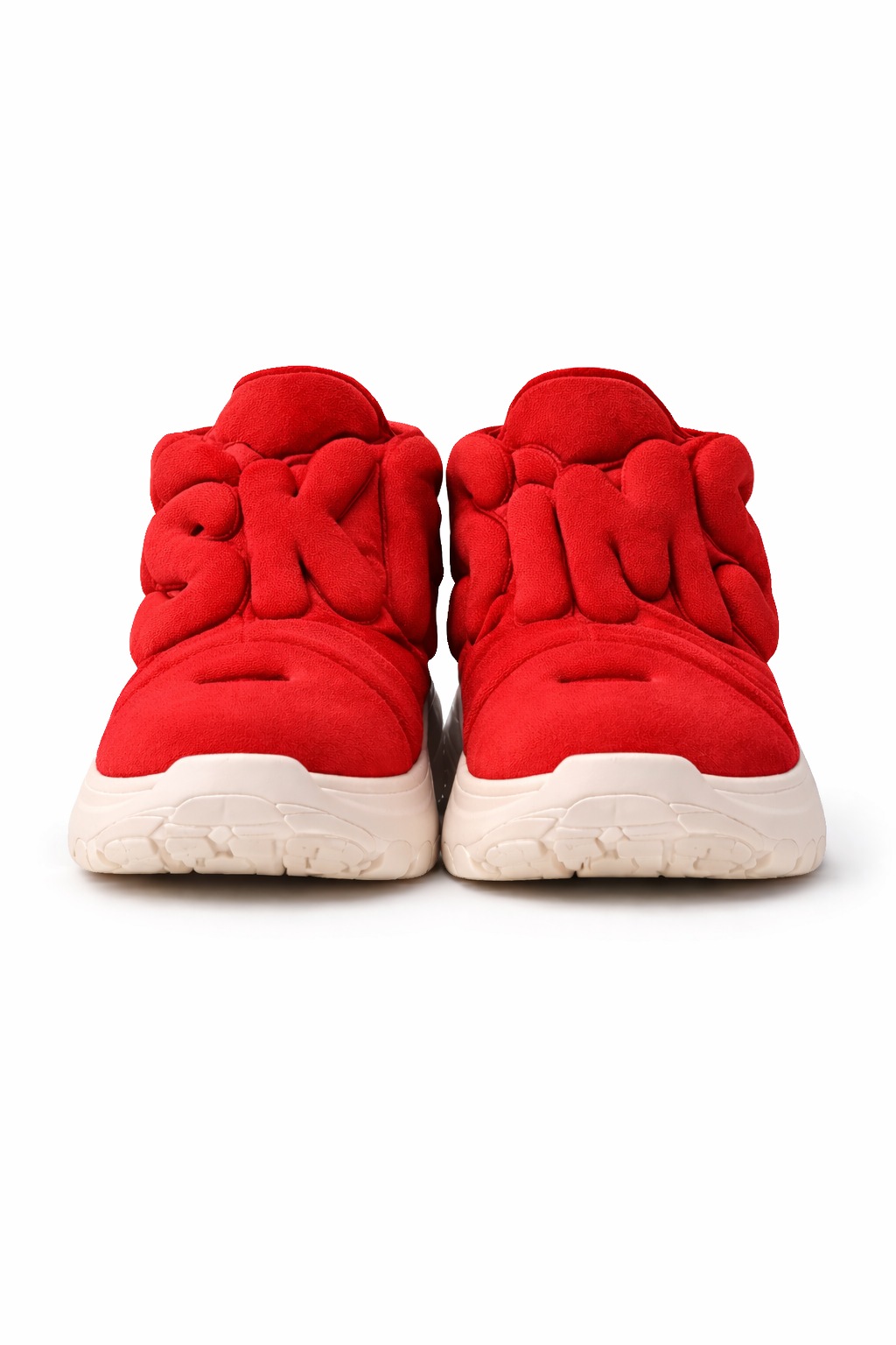
A useful next comparison would keep the last and upper proportions fixed while reviewing sole color, wordmark depth and foot entry. Construction, fit, materials and physical feasibility remain untested.
PROJECT CONTEXT
This independent study asks how a recognizable wordmark could become the structure of a footwear upper. The concept concentrates on one visual idea rather than adding multiple competing surface treatments.
The enlarged letterforms define the upper and create the main silhouette. Their scale turns graphic identity into a three-dimensional feature rather than a small applied logo.
Saturated red links the letterforms into one upper, while the darker sole creates a visual base. The reduced palette keeps attention on shape and recognition.
The retail-style rendering communicates a presentation direction. It does not establish a material choice, a tested fit or a viable production method.
PROCESS NOTEBOOK
A retrospective reading of the supplied concept image, followed by possible directions for development.
Archive review connects the existing work below. Next explorations describe new development ideas.
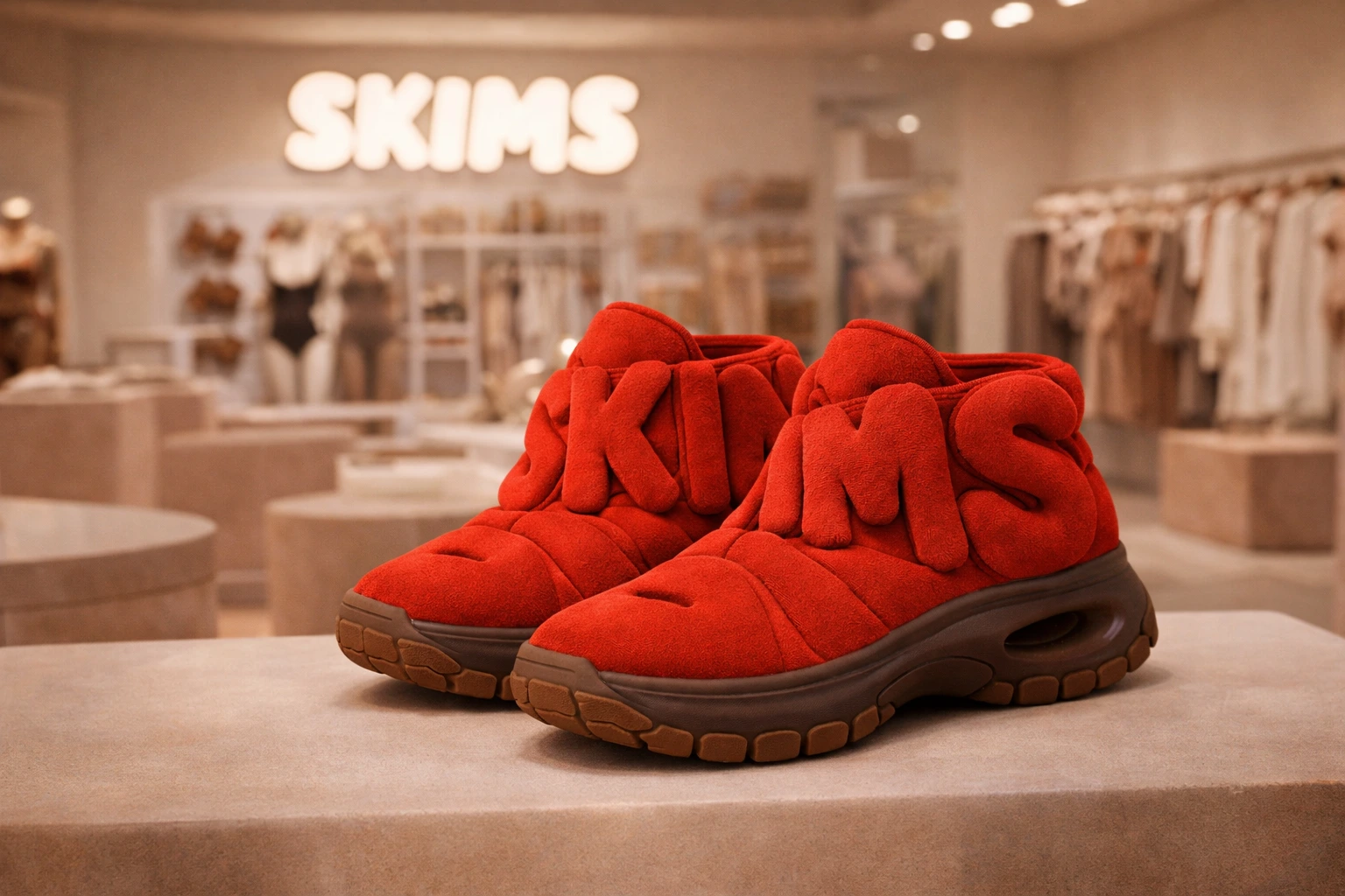
01 / Archive review
The upper is dominated by oversized letterforms while the darker sole carries the silhouette. These are the two primary relationships visible in the image.
02 / Next exploration
One new direction would keep the wordmark raised and pronounced; another would reduce its depth so the overall form reads first. These are proposals, not existing prototypes.
03 / Next exploration
An actual model would be needed to examine openings, contact areas and thickness. No wireframe is fabricated from this visualization.